Code self-review
Situation
You've tentatively finished a chunk of work and you're intending to submit a PR. (Or to push your changes to any other place where they are going to be conveyed to production.)
Approach
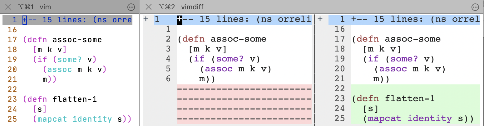
Review your own changes using git difftool (or any other side-by-side change
viewing mechanism). To reduce author's blindness, make your changes look
unfamiliar by changing font, colours and, if possible, the screen you're viewing
them on.
The same idea applies to reviewing other kinds of work. For example, when you write a document in Markdown, proofread the rendered page in the browser, not the original Markdown.
Rationale
Why would you review your own code before submitting it for review by others? Because it's a tighter feedback loop. Tighter feedback loops make everything faster. And it saves others' time if they don't have to point out problems that you could have found yourself.
I haven't looked for data on author's blindness and how much it can be reduced by changing colours, font etc. I've only heard anecdotes. You'll have to see whether it makes a difference for you.
Example
This is specific to how I work. You'll have to find an equivalent that works with your tools. All of this is intended to make the code look as different as possible, while staying easy to read.
| Writing code | Reviewing code | |
|---|---|---|
| screen | normal pixel density, large external display | MacBook Retina Display |
| font | 12 pt JetBrains Mono | 15 pt Courier |
| viewing mode | normal Vim | Vim in diff mode |
| colorscheme |
Vim light background default | github (from GitHub: cormacrelf/vim-colors-github)
|
deltais great for viewing diffs. I use it in unified mode forgit diff. For self-reviews I still use Vimdiff because I want the output to look different from everydaygit diffoutput. You could write glue code to makedeltawork for both purposes.I've tried side-by-side difftools other than Vimdiff and
delta, but, at least on Mac, they all sucked.15 pt is the size that allows a text width of about ninety characters Courier in side-by-side view on my laptop display. I have an iTerm2 shortcut for switching to this ‘Diff’ profile.
Here are my Vim settings, which are activated automatically in diff mode:
" Credits:
" - https://stackoverflow.com/a/17183382/5091738
" - https://vi.stackexchange.com/a/10898/19694
" - https://www.reddit.com/r/vim/comments/2mfg88/color_scheme_for_vimdiff/cm3rau0/
" - http://vim.wikia.com/wiki/Xterm256_color_names_for_console_Vim?file=Xterm-color-table.png
" - https://github.com/endel/vim-github-colorscheme

if &diff
    set number
    set norelativenumber
    set diffopt+=iwhite
    colorscheme github
    highlight DiffAdd    cterm=none ctermbg=194
    highlight DiffChange cterm=none ctermbg=255
    highlight DiffText cterm=none ctermbg=189
    highlight DiffDelete cterm=none ctermbg=224
endif